
Arpi on Tile
Pantone’s Cloud Dancer: A Neutral to Elevate Modern Interiors
How a soft white palette redefines through texture, surface innovation, and architectural scale
Pantone® 11-4201 Cloud Dancer. (Courtesy Pantone LLC)
By Arpi Nalbandian Tileometry
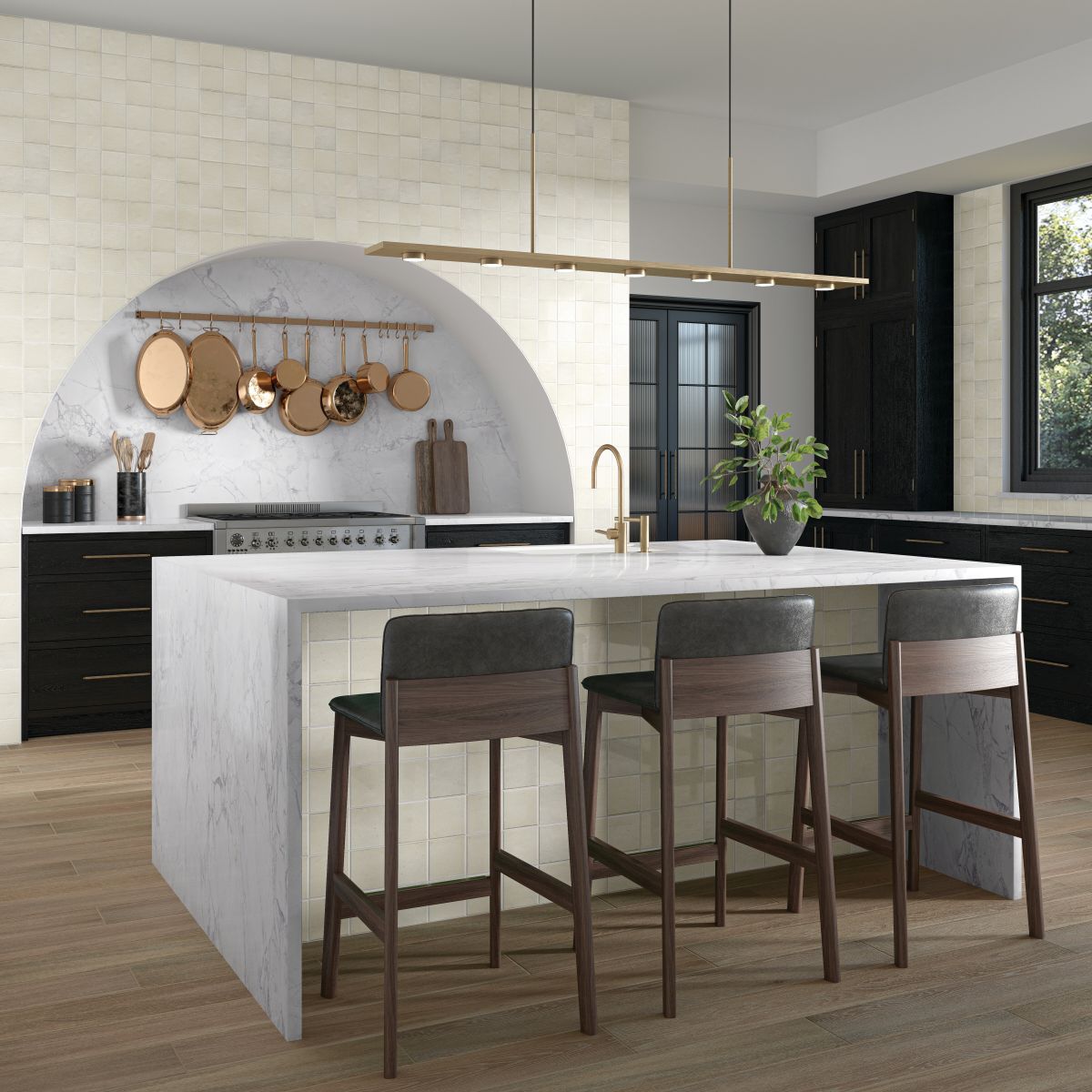
Pantone’s Color of the Year 2026, PANTONE 11-4201 Cloud Dancer, is familiar territory for design professionals. Rather than a conventional white, it functions as a design framework – a near-white that functions in a material-driven role rather than a purely chromatic one. Defined by Pantone as a calming and versatile neutral, Cloud Dancer is set to pair seamlessly with tile’s inherit strength in texture, surface expression, light response, and long-term performance. Within the design community, the announcement of Cloud Dancer prompted an immediate and polarized response. While some professionals embraced its clarity, luminosity, and understated simplicity – viewing it as a refined neutral capable of elevating richly saturated accents – others reacted with skepticism, questioning the choice for its perceived restraint. The reception ranged from quiet indifference to genuine surprise, underscoring the divide between those who value calm versatility and those seeking a more expressive directional statement. By contrast, previous Pantone Colors of the Year were met with far more unified enthusiasm. Viva Magenta (PANTONE 18-1750), the 2023 selection, was widely celebrated for its boldness and emotional intensity, while Very Peri (PANTONE 17-3938) in 2022 resonated with designers and architects for its forward-looking, creative energy. For architects, designers, distributors, and retail showroom teams, the opportunity is unmistakable: position Cloud Dancer as a unifying element that bridges warm minimalism, the ethos of quiet luxury, and the increasingly tactile sensibility shaping 2025–2026 interiors. Tile is uniquely suited to this role, offering a material-driven way to express the color through stone-inspired surfaces, plaster-like finishes, satin glazes, subtle micro-reliefs, and the seamless continuity of large-format applications
From AlysEdwards is the newly launched Brickit collection. Available in six colors, this 2x18 porcelain tile “provides a durable and effortless surface for many applications. The emulation of aged cotton with irregular edges gives this collection a handmade look as though it has stood the test of time,” the company notes. (Image courtesy AlysEdwards Tile & Stone
Why Cloud Dancer Works So Well in Tile-Driven Spaces
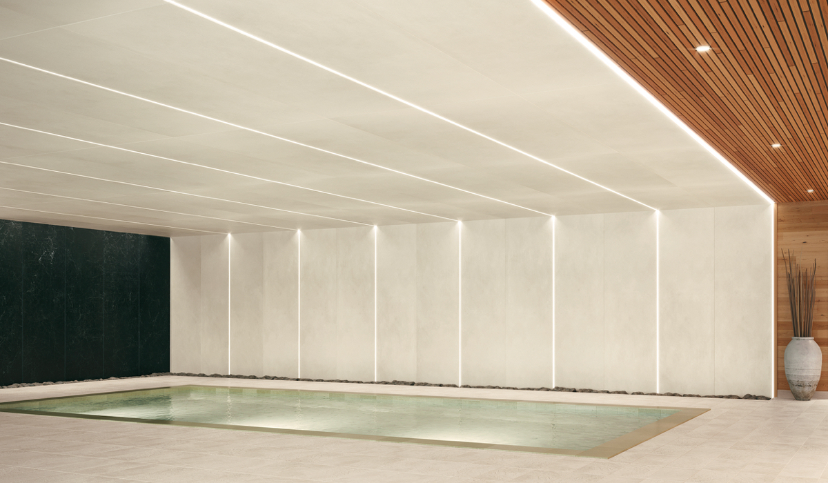
Modern interiors are moving away from stark, gallery-white minimalism and toward softened neutrals with depth – tones that hold up under layered lighting plans, mixed materials, and real-world wear. Cloud Dancer’s value is that it reads as clean and bright, not icy, allowing it to:
- Extend daylight and bounce artificial light more gently (especially in matte and satin finishes).
- Soften transitions between warm woods, brushed metals, natural stone, and colored accents.
- Emphasize relief and texture – which is where tile is currently pushing hardest while simultaneously remaining focused on tactile realism and surface technology.Tone-on-tone transitions (floors, walls, wet areas) that read as intentional.
Further, harmonizing with Cloud Dancer should not be best expressed with a single “white tile,” rather, as a family of off-whites across multiple surface aesthetics: limestone, travertine, plaster, chalky concrete, and subtly veined marbles.
Marrakesh from RAK Ceramics is a collection of wall brick tiles inspired by the soft pastel hues of the Maghreb (a region of North Africa bordering the Mediterranean Sea). (Image courtesy RAK Ceramics)
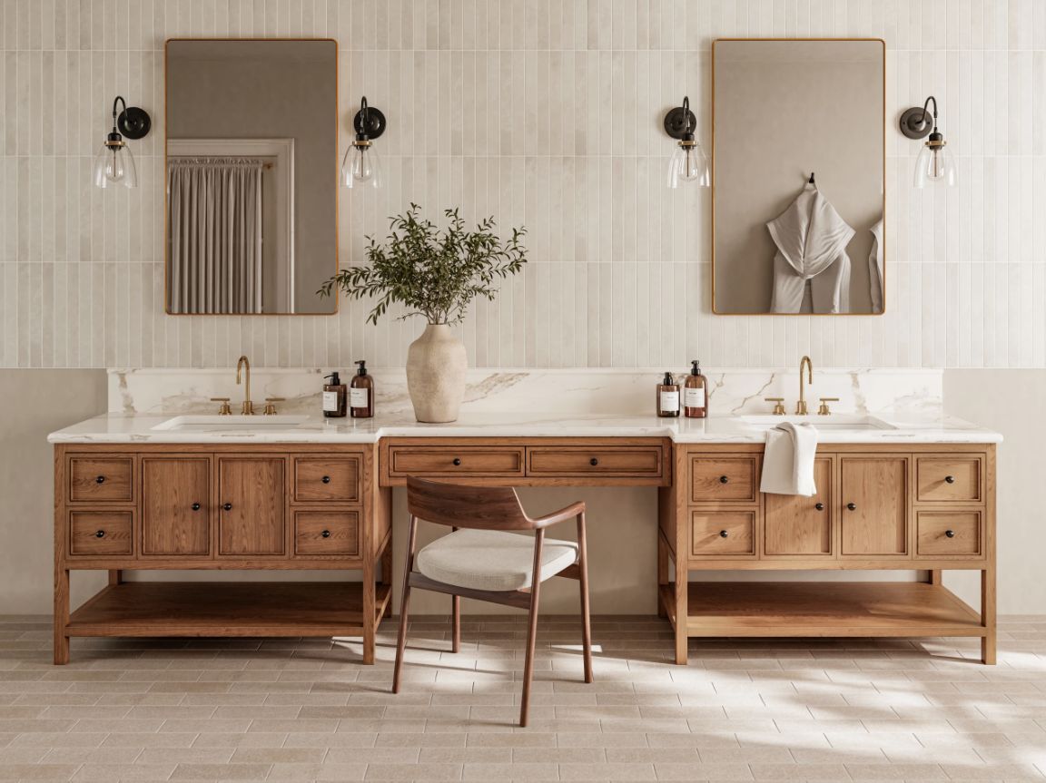
Build Quiet Luxury with Soft Stone Looks
Providing quiet luxury in interiors is fundamentally about restraint coupled with material quality. This translates to visuals that offer controlled movement, refined finishes, and a palette that doesn’t strive for attention. This is exactly how Cloud Dancer should be utilized – by becoming the connection to elevating tile’s role in any setting, especially when it is specified with:
- Satin/matte finishes to reduce glare and make the surface feel more architectural.
- Low-contrast grout (warm off-white rather than bright white) to preserve calm continuity.
- Tone-on-tone transitions (floors, walls, wet areas) that read as intentional.
Importantly, when pairing tile with Cloud Dancer, the foremost decision relies on undertone. Identify whether your project’s “white” needs to skew towards warm (cream/ivory) or cool (porcelain/gray-white) based on adjacent woods and metals. Remember that Cloud Dancer typically performs best as a warm-leaning white in hospitality/residential and a balanced white in workplace/retail. Select accordingly.
: Neutral colors and delicate nuances mark the face of Calce, a line of porcelain tile panels inspired by wet plaster and concrete. The combination results in a soft, chalky visual that is both sophisticated and thoroughly contemporary. Made by Laminam SpA. (Image courtesy Crossville Inc.
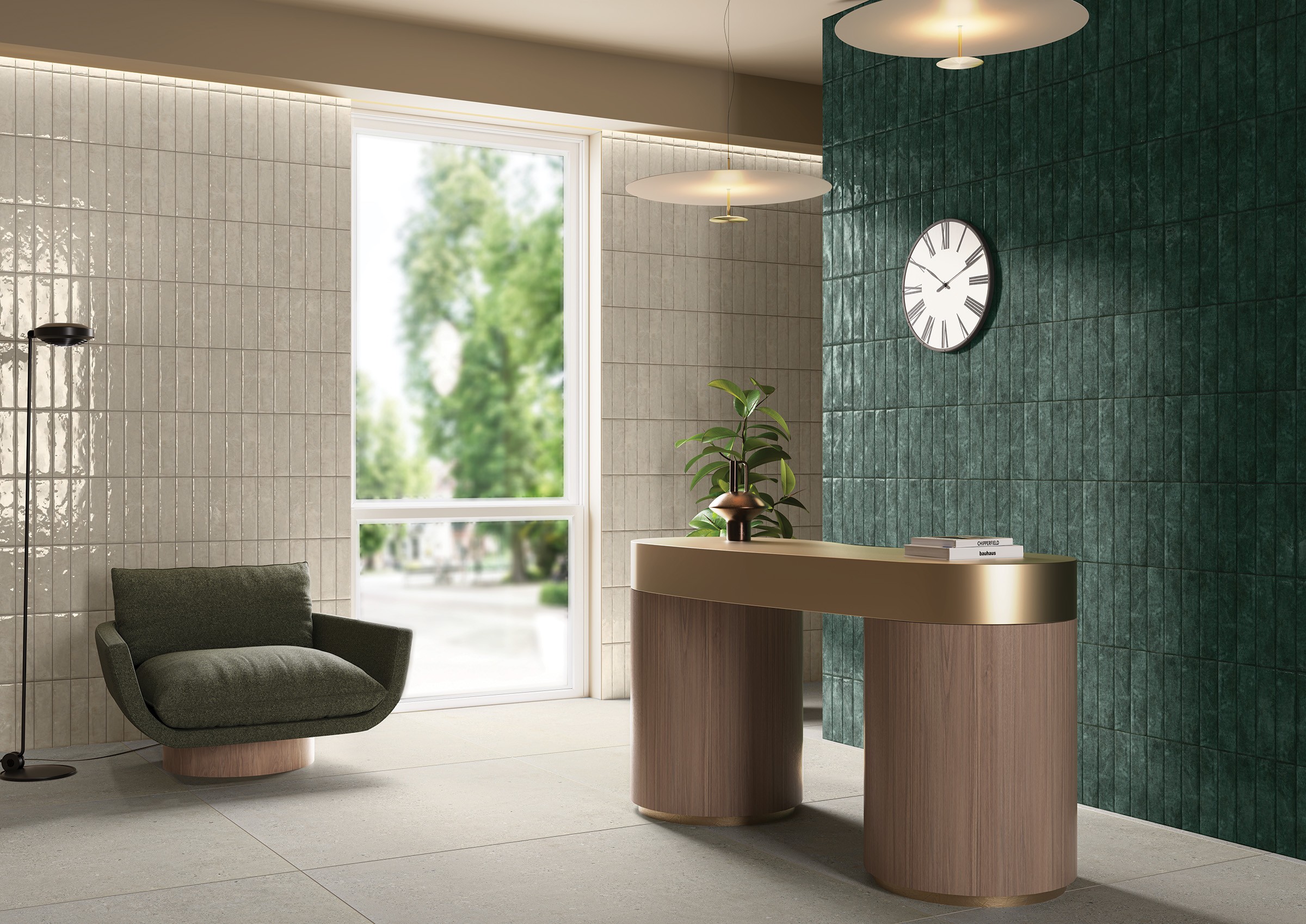
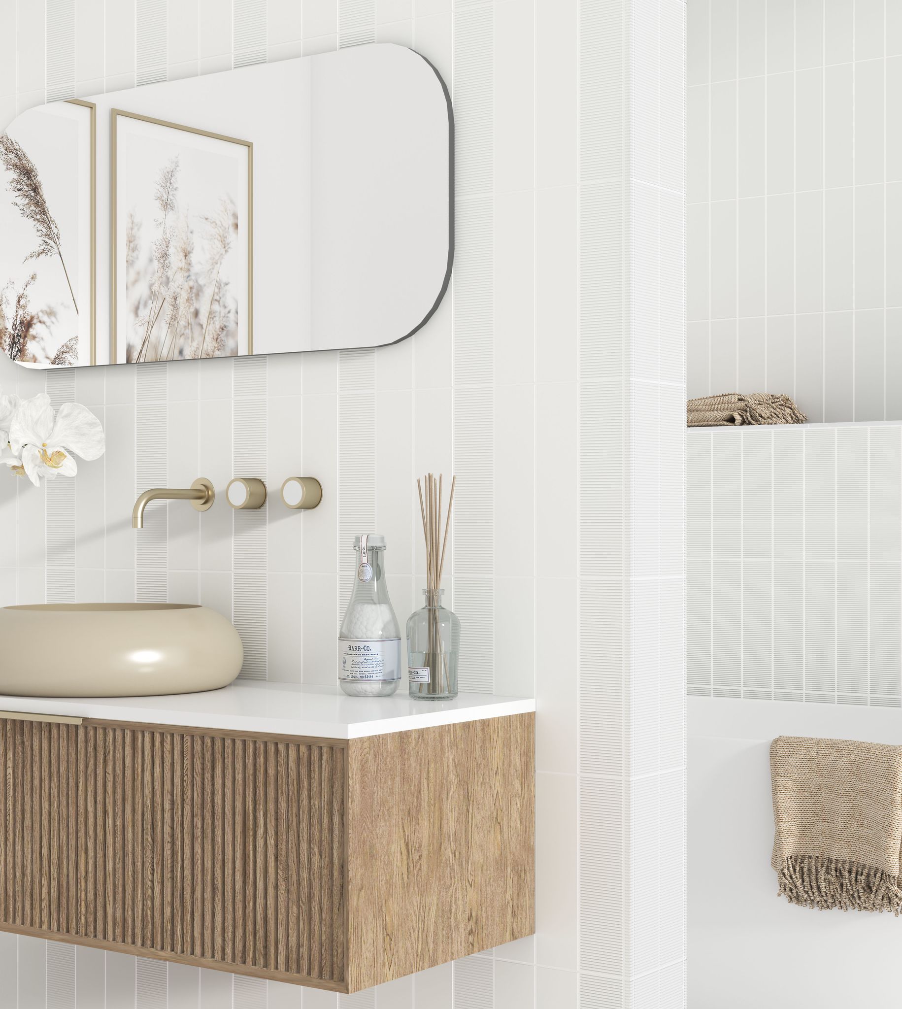
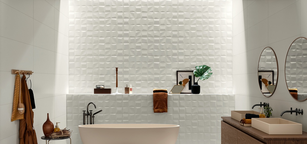
Let Texture Do the Work (Fluted, Linear, Micro-Relief)
Color alone is rarely the hero when it comes to design. Although the palette is essential, the valiant role is played by texture. As such, Cloud Dancer is tailor-made for the current wave of tactile tile surfaces: kit-kat formats, fine ribbing, linear striations, and micro-reliefs that effortlessly capture and/or refract light. From reception areas and elevator lobbies (a wall relief conveys a handcrafted, high-end aesthetic), to powder rooms (vertical surfaces with directional lighting), and kitchen backsplashes (small-format textures that deliver scale and detail). It’s clear that texture in tile provides the necessary fluidity to Cloud Dancer’s blank canvas.
: From ADEX is the Horizon Collection, a modern ceramic tile collection that offers six subtle hues in matte and glossy glazes to create visual depth and textural interest. (Image courtesy ADEX USA.)
Daltile’s Contempee is an artisanal wall tile designed with uneven edges, dimensional structures, and a crackle finish. The nature-inspired palette, with mix-and-match options, boasts high variation from piece to piece. (Image courtesy Daltile.)
Amplify ceramic wall tile from Florida Tile effortlessly showcases its three-dimensional energy. Available in seven options, this series creates the impression of continuous movement. (Image courtesy Florida Tile.)
Combinations That Feel Current Without Looking Trendy
When presented with Cloud Dancer as a foundation, your complementary product pairings will determine whether the interior reads as warm, crisp, or intentionally contrasted. Let’s take a look at several examples of surface visual outcomes:
- Bronze/brass: Especially in bathroom hardware and decorative lighting; the metal becomes the visual punctuation.
- Soft greens and clay accents: Biophilic palettes become calmer when anchored by an off-white tile field (think muted sage cabinetry, terracotta textiles).
- Graphite/ink contrasts: Limited use of black, minimal framing, or dark grout in small-format tile applications.
In residential kitchens specifically, 2025-2026 backsplash trends continue to lean towards a “soft neutral and detail” approach. Not only is the look visually pleasing, but it has lasting appeal, which is a vital aspect to Aging in Place seekers. Here are some thoughts to keep in mind when specifying tile that harmonizes with shades similar to Cloud Dancer:
Grout selection: Prioritize warm grout colors (such as off-white) and avoid stark bright white unless the project is intentionally cool/minimal. Finish drives perceived color: Matte reads warmer/softer; glossy reads brighter/cooler and amplifies lighting inconsistencies. Trims and transitions: Metal trims should be selected early (brushed nickel vs champagne bronze changes the whole visual). Sustainability matters: Low-impact production, recycled content, and carbon-conscious options increasingly influence decisions – especially in commercial projects.
Ultimately, the value lies not in a color’s ability to stand alone, but in its capacity to elevate the surfaces around it. For the tile industry, this presents a timely opportunity to lead the conversation – demonstrating how nuance, texture, and material integrity can transform subtle tones into true design drivers. Through advanced surface technologies, refined finishes, and scale-driven continuity, tile naturally moves beyond color to function as an architectural framework – one that aligns seamlessly with the calm, tactile, and enduring interiors defining the years ahead.
What’s Next?
With the new year comes fresh opportunities to see, touch, and experience the latest tile product launches first-hand. The first quarter of 2026 begins with TISE, taking place January 26–29 in Las Vegas, followed by Expo Revestir (March 9-13) in São Paulo, Brazil, and of course, Coverings, held March 30–April 2, also in Las Vegas. With such a high concentration of innovation on display, it’s no surprise that tile professionals, architects, designers, and specifiers around the world eagerly anticipate these industry-leading events.